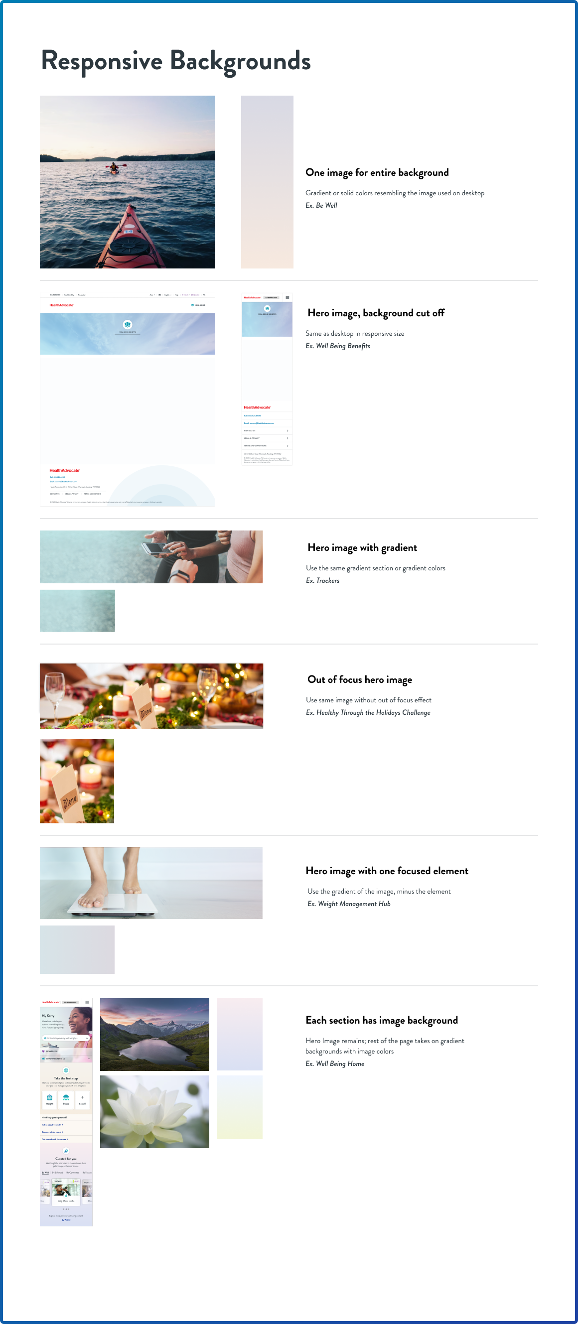
Our prototype served as the authoritative reference for both our internal development team and an external third-party platform provider. It offered pixel-perfect specifications, styles, and assets directly to the development team, with real-time accessibility for both teams throughout each sprint. Synchronous commenting facilitated efficient communication, vital for seamless development cycles. We fostered close collaboration with internal teams across the organization, facilitating a cohesive marketing-to-sales-to-product experience by supplying coordinated assets, guides, and collaborative direction. In numerous instances, we successfully bridged internal silos, bringing teams together to collaboratively solve problems.
We initiated the design process with a high-fidelity approach, leveraging an established design system to facilitate future enhancements and modifications. While this methodology may differ from conventional UX and UI practices, it proved effective in enhancing communication of design decisions with stakeholders and establishing a well-defined content roadmap. I assumed responsibility for the responsive design environment, tasked with arranging various components across diverse screens to replicate the desktop experience while ensuring a smooth and intuitive user experience on smaller screens, such as mobile devices. This involved optimizing layout and interaction elements to accommodate the constraints of reduced screen real estate, all while upholding usability and visual coherence.
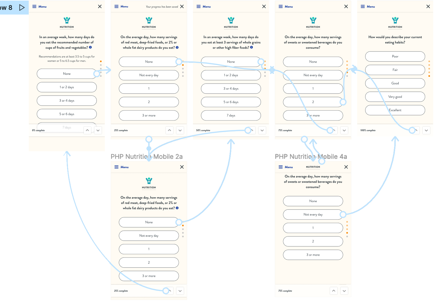
We meticulously ensured that all screens possessed clickable functionality with a logical and user-friendly flow. In instances where screens exhibited greater complexity, we dedicated our efforts to crafting specific interactions, thereby streamlining the development process for our developers and providing a transparent view to stakeholders. This approach not only facilitated comprehension of forthcoming screens but also served as an effective means of communication across diverse stakeholder groups. Our focus on interaction design was instrumental in achieving these outcomes.
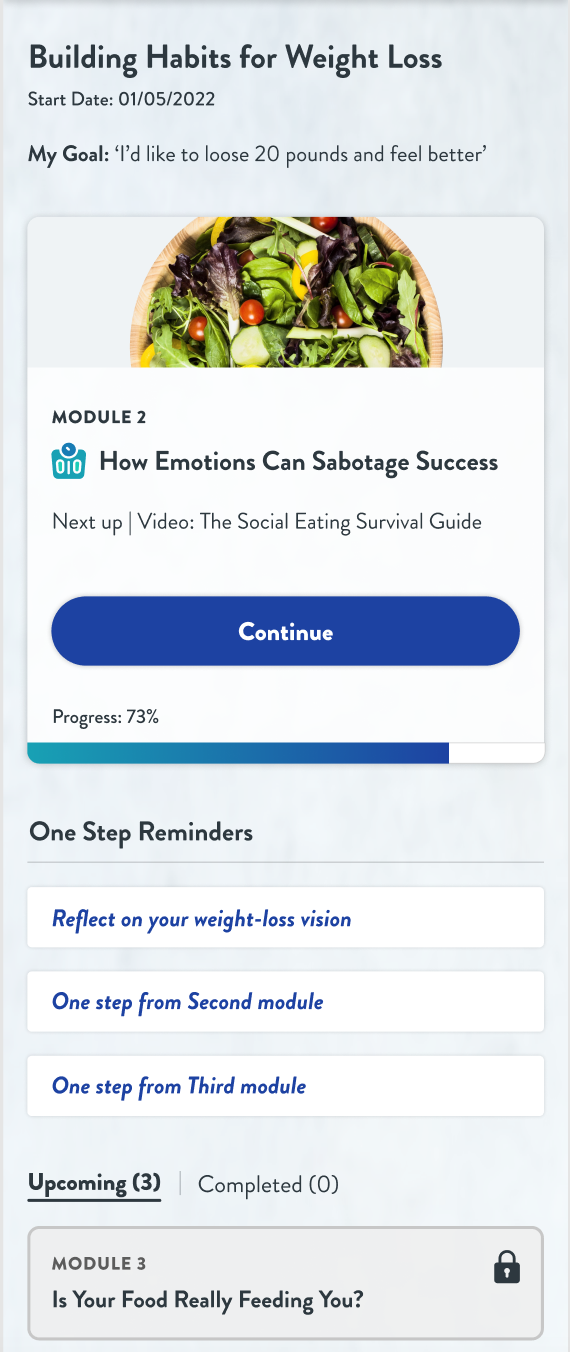
From a visual design standpoint, a substantial portion of assets had originally been designed for the desktop interface, necessitating a transformation into a responsive format. This transition introduced notable changes in typography hierarchy and also raised concerns regarding the adaptability of certain images to smaller phone screens. The importance of visual design became evident in our endeavor to strike a harmonious balance between the desktop and mobile user experiences without resorting to a complete divergence. To achieve this, we placed significant emphasis on optimizing the usability of various design components. In certain instances, components exclusively designed for mobile interfaces were retroactively integrated into the desktop environment, thereby paving the way for a more streamlined process in the development of future mobile applications. Visual design played a pivotal role in bridging the gap between these two design paradigms while upholding the principles of usability and aesthetic cohesion.
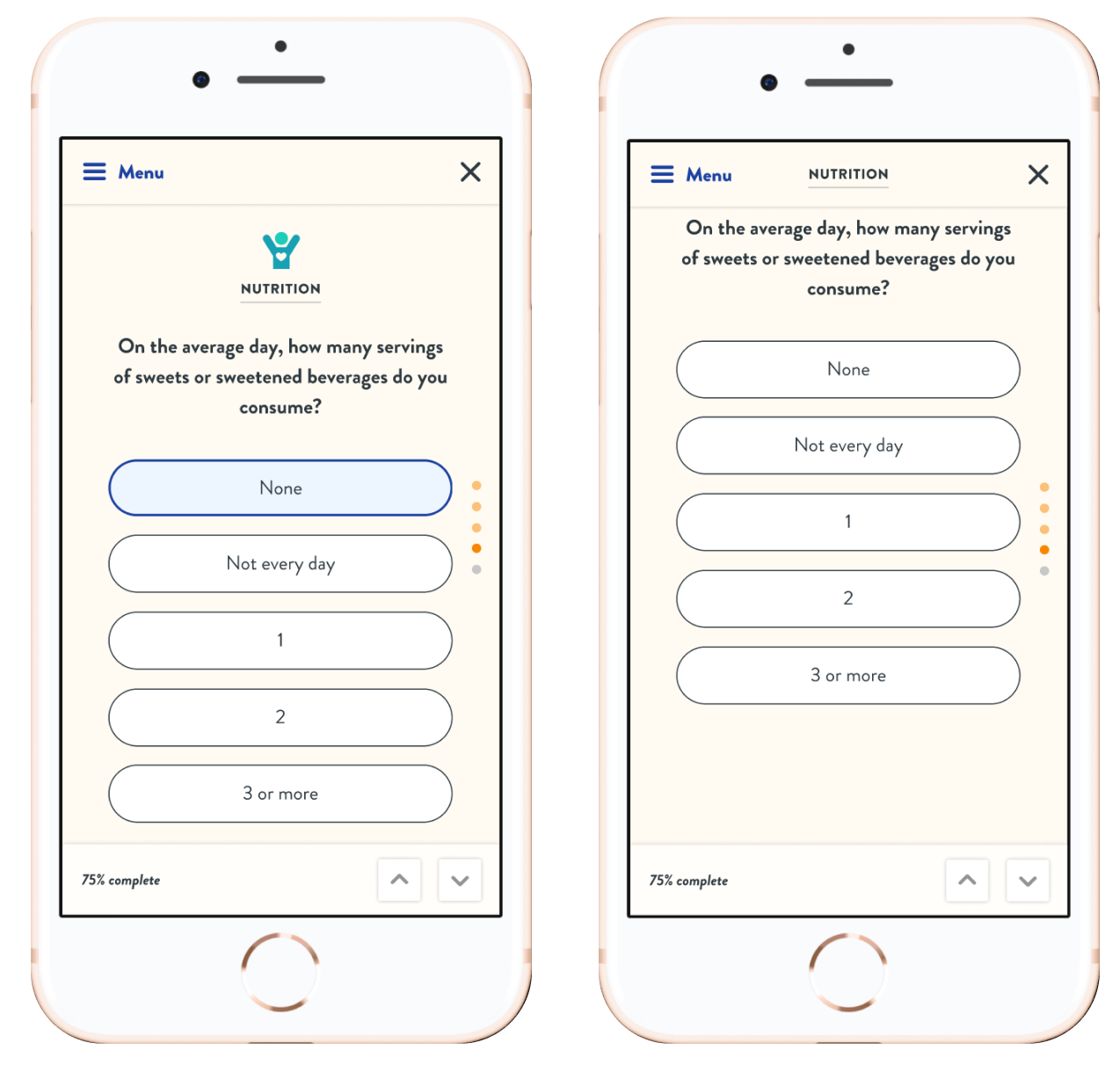
Accessibility considerations have consistently held a central position in our design philosophy at Foxgroove, a commitment that I have carried with me since my tenure at Freedom Mortgage. Adhering to ADA and WCAG standards has been a fundamental aspect of our approach. For instance, at Foxgroove, we diligently ensured typography was accessible to individuals with disabilities, and our design process consistently revolved around user-centered thinking, with a focus on how users would interact with the website. To illustrate, we faced a unique challenge when tasked with designing an online quiz for both desktop and mobile interfaces. In cases where the quiz presented a multitude of answer options, failing to provide a clear indication of the user's progress within the quiz could lead to user fatigue and potentially cause users to abandon the quiz prematurely, ultimately thwarting the intended user experience. The integration of accessibility standards into our UX design practices allowed us to address such challenges and ensure that our digital products were inclusive and user-friendly, aligning with the principles of ADA and WCAG.
At the commencement of each workweek, the UX team initiated a series of concise, and occasionally more extended, meetings to assess the progress of ongoing tasks and identify any emergent alterations requiring attention. Our team operated with well-structured sprint plans, typically spanning one month in duration, and maintained an updated record of these plans on Airtable. This practice facilitated an in-depth understanding of the status of development, content, and design tasks, which were further categorized into responsive and desktop experiences. Significant modifications to ongoing projects necessitated design-focused meetings, fostering collaboration among team members. During these sessions, all team members actively engaged with the Figma file to ensure alignment with project requirements, adherence to our design standards, and provided a platform for brainstorming and ideation in response to new challenges and changes.
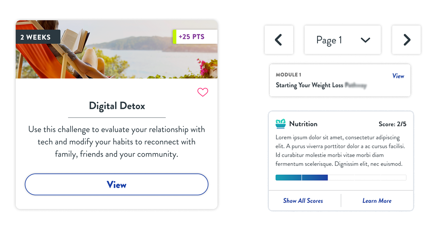
We cultivated an extensive design system that seamlessly harmonized both desktop and mobile environments. This design system was exhaustively documented, encompassing intricate specifications such as button shapes, sizes, and the delineation of specialized rules applicable to both desktop and responsive interfaces. The implementation of such a robust design system enhanced our operational efficiency and facilitated the consistent maintenance of design patterns across all platforms. Additionally, we recognized the paramount significance of upholding brand consistency and thus curated a dedicated brand guide tailored specifically for our client's marketing team. This initiative enabled us to better serve every facet of the organization, ensuring that the design language remained coherent and aligned with the overarching brand identity. In summary, our meticulous attention to detail and unwavering commitment to establishing design systems that prioritize efficiency and consistency culminated in the delivery of exceptional outcomes for our clients.
